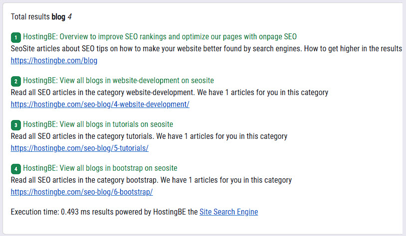
Create website search engine in php
in PhpCreate website search engine in PHP Why a search engine on your website? What requirements mus..
15-01-2023 0 reacties
There is no better place to be if you are completely new to the web and want to learn how to create a responsive bootstrap website than right here. This article will walk you through the process of using Bootstrap to make your site responsive in detail.
You don't have to be a web design pro to create a mobile-friendly site. By obviating the need to tinker with CSS Grid or Flex-box, Bootstrap simplifies the process of creating a mobile-friendly site.
Awesome! We have reached the point in the lesson when all prerequisite information has been covered. Let’s begin.
Keep in mind that all you need to get the website up and running is a text editor and a browser. To test how it would work as a real website, however, you need look at free VPS options like Amazon Web Services and launch your site. This allows you to test how it performs in a variety of environments and browsers.
Responsive Bootstrap configuration is the first order of business. You just need to add the code to your webpages to make it work.
<meta name="viewport" content="width=device-width, initial-scale=1">With the following code, a meta tag is created that instructs the browser to adjust the page's width according on the viewing device's display size. The default webpage size was also selected (1 for scaling). In a nutshell, we inform the browser that a responsive web application is in the works.
Let's begin making our website by deciding on a location for it and then creating an index.html page inside that location. To begin, let's open our index.html page in your preferred coding editor and proceed to establishing the fundamental HTML file structure and all required CDNs.
<!DOCTYPE>
<html>
  <head>
    <title>Portfolio Website</title>
    <!-- CSS only -->
    <link rel="stylesheet" href="https://stackpath.bootstrapcdn.com/bootstrap/5.0.0-alpha1/css/bootstrap.min.css" integrity="sha384-r4NyP46KrjDleawBgD5tp8Y7UzmLA05oM1iAEQ17CSuDqnUK2+k9luXQOfXJCJ4I" crossorigin="anonymous">
    <link rel="stylesheet" href="style.css">
    <!-- JavaScript and dependencies -->
<script src="https://cdn.jsdelivr.net/npm/popper.js@1.16.0/dist/umd/popper.min.js" integrity="sha384-Q6E9RHvbIyZFJoft+2mJbHaEWldlvI9IOYy5n3zV9zzTtmI3UksdQRVvoxMfooAo" crossorigin="anonymous">
</script>
 <script src="https://stackpath.bootstrapcdn.com/bootstrap/5.0.0-alpha1/js/bootstrap.min.js" integrity="sha384-oesi62hOLfzrys4LxRF63OJCXdXDipiYWBnvTl9Y9/TRlw5xlKIEHpNyvvDShgf/" crossorigin="anonymous"></script>
  </head>
  <body>
……………….
  </body>
</html>
In that case, let's create a new file for the user-defined styles after that's done. We may save it as styles.css and keep it in the same directory.
The moment has come to begin work on our website. The navigation structure will be the first component we build. We'll put the following code within the body tags.
<!-- Navbar -->
<nav class="py-3 navbar navbar-expand-lg fixed-top auto-hiding-navbar">
  <div class="container">
    <a class="navbar-brand"" href="#">
      <img class="logo" src="logo.png" /> SoftwareHouse
    </a>
    <button class="navbar-toggler" type="button" data-toggle="collapse" data-target="#navbarSupportedContent" aria-controls="navbarSupportedContent" aria-expanded="false" aria-label="Toggle navigation">
      <span class="navbar-toggler-icon"></span>
    </button>
    <div class="collapse navbar-collapse" id="navbarSupportedContent">
      <ul class="navbar-nav ml-auto">
        <li class="nav-item">
          <a class="nav-link active" aria-current="page" href="#">Home</a>
        </li>
        <li class="nav-item">
          <a class="nav-link" href="#">About Us</a>
        </li>
        <li class="nav-item">
          <a class="nav-link" href="#">Projects</a>
        </li>
        <li class="nav-item">
          <a class="nav-link" href="#">Contact</a>
        </li>
      </ul>
    </div>
  </div>
</nav>
<!-- End Navbar -->
We're in need of a logo for our online presence. To utilize an existing picture or icon as a logo, just copy and paste it’s URL into the assets folder within the website's root directory. Make sure your picture and its location are accurate before you import it; I imported my logo as a logo.png file.
We'll start by giving our menus our own unique look. Launch styles.css and insert the following.
body {
  display: block;
  overflow-x: hidden;
}
nav {
  background-color: white;
}
.navbar-brand img {
  max-height: 50px;
}
.navbar-brand {
  font-size: 24px;
  text-transform: uppercase;
  font-weight: 900;
  color: #683aa4;
}
nav ul li a {
  color: #a9a9a9;
  font-size: 22px;
  margin: auto 10px;
}
nav ul li a:hover {
  color: #683aa4;
}
Great, your menu is ready now!
Creating a hero section is the next thing we need to do in order to finish putting up our website. Let's create a new section underneath the code for the navigation and fill it with the picture, some text, and three cards.
You will want a picture, which I have designated as hero-img.png, as well as three icons for the cards in order to complete this section.
<!-- Hero section -->
<section id="hero">
  <div class="container">
    <div class="row">
      <div class="col">
        <h1>Software<br>Development</h1>
        <p>Lorem ipsum dolor sit amet, consectetuer adipiscing elit. Donec odio. Quisque volutpat mattis eros. Nullam malesuada erat ut turpis. Suspendisse urna nibh, viverra non, semper suscipit, posuere a, pede.</p>
        <button type="button" class="btn btn-dark btn-large">Learn more</button>
      </div>
      <div class="col img-col">
        <img src="hero-img.png" class="img-fluid" alt="Software Development">
      </div>
    </div>
    <div class="row cards">
      <div class="col-md-4 d-flex justify-content-center">
        <div class="card" style="width: 18rem;">
          <div class="card-body">
            <img src="icon1.svg" class="icon" alt="Service One"/>
            <h5 class="card-title">Web Dev</h5>
            <p class="card-text">Some quick example text to build on the card title and make up the bulk of the card's content.</p>
          </div>
        </div>
      </div>
      <div class="col-md-4 d-flex justify-content-center">
        <div class="card" style="width: 18rem;">
          <div class="card-body">
            <img src="icon2.svg" class="icon" alt="Service Two"/>
            <h5 class="card-title">Machine Learning</h5>
            <p class="card-text">Some quick example text to build on the card title and make up the bulk of the card's content.</p>
          </div>
        </div>
      </div>
      <div class="col-md-4 d-flex justify-content-center">
        <div class="card" style="width: 18rem;">
          <div class="card-body">
            <img src="icon3.svg" class="icon" alt="Service Three"/>
            <h5 class="card-title">Security</h5>
            <p class="card-text">Some quick example text to build on the card title and make up the bulk of the card's content.</p>
          </div>
        </div>
      </div>
    </div>
  </div>
</section>
<!-- End Hero section -->
We still need to add some unique styles in order to give it a nice appearance. Therefore, let's go ahead and open up our styles.css file and add the following code to it.
section {
  padding-top: 50px;
  padding-bottom: 50px;
}
section h1 {
  text-transform: uppercase;
  font-weight: 900;
  color: #683aa4;
  text-align: left;
  margin-bottom: 20px;
}
section p {
  font-size: 16px;
  font-weight: 300;
}
button {
  max-width: 50%;
  border-radius: 50px !important;
}
#hero .col {
  justify-content: center;
  flex-direction: column;
  display: flex;
}
#hero .img-col {
  justify-content: flex-end;
  margin-top: 100px;
}
#hero img {
  max-width: 130% !important;
  width: 130%;
}
#hero .card {
  box-shadow: 11px 7px 16px #f9f9f9;
  border: 0;
  text-align: center;
}
#hero .icon {
  width: 50px;
  height: 50px;
  margin-bottom: 20px;
}
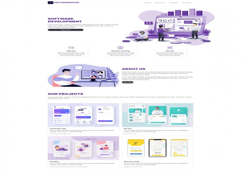
Your website should now resemble the one seen in the picture below, so great job! (just with different photos).
The About Us page is the next area of the site we'll be developing. Also, we'll be including a picture here, so remember to create a "about-us.png" file in your assets directory.
Get yourself to your index.html file, and add the following code just below the hero section.
<!-- About us section -->
<section id="about-us">
  <div class="container">
    <div class="row align-items-center">
      <div class="col">
        <img src="about-us.png" class="img-fluid" alt="About Us">
      </div>
      <div class="col text-col">
        <h1>About Us</h1>
        <p>Lorem ipsum dolor sit amet, consectetuer adipiscing elit. Donec odio. Quisque volutpat mattis eros. Nullam malesuada erat ut turpis. Suspendisse urna nibh, viverra non, semper suscipit, posuere a, pede.</p>
        <p>Lorem ipsum dolor sit amet, consectetuer adipiscing elit. Donec odio. Quisque volutpat mattis eros. Nullam malesuada erat ut turpis. Suspendisse urna nibh, viverra non, semper suscipit, posuere a, pede.</p>
        <button type="button" class="btn btn-dark btn-large">Let's meet</button>
      </div>
    </div>
  </div>
</section>
<!-- End About us section -->
And here comes the next segment.
Now comes the meatiest section of every software company website: the testimonials. We'll create a section for our projects that has four cards in two columns.
Make sure you have at least four more photos in your assets folder for this step; they may be of whatever you choose, but might be examples of your own work.
Let's tack this code at the bottom of the "About Us" page.
<!-- Projects section -->
<section id="projects">
<div class="container">
  <div class="row align-items-center projects">
    <div class="col">
      <h1>Our Projects</h1>
      <p>Lorem ipsum dolor sit amet, consectetuer adipiscing elit. Donec odio. Quisque volutpat mattis eros. Nullam malesuada erat ut turpis. Suspendisse urna nibh, viverra non, semper suscipit, posuere a, pede.</p>
    </div>
  </div>
  <div class="row align-items-center">
    <div class="col">
      <div class="card mb-3">
        <img src="project1.jpg" class="card-img-top" alt="...">
        <div class="card-body">
          <h5 class="card-title">Investment App</h5>
          <p class="card-text">This is a wider card with supporting text below as a natural lead-in to additional content. This content is a little bit longer.</p>
          <p class="card-text"><small class="text-muted">React Native, Java, REST Api</small></p>
        </div>
      </div>
    </div>
    <div class="col">
      <div class="card mb-3">
        <img src="project2.jpg" class="card-img-top" alt="...">
        <div class="card-body">
          <h5 class="card-title">My Doc</h5>
          <p class="card-text">This is a wider card with supporting text below as a natural lead-in to additional content. This content is a little bit longer.</p>
          <p class="card-text"><small class="text-muted">Kotlin, REST Api</small></p>
        </div>
      </div>
    </div>
  </div>
  <div class="row align-items-center">
    <div class="col">
      <div class="card mb-3">
        <img src="project3.jpg" class="card-img-top" alt="...">
        <div class="card-body">
          <h5 class="card-title">Socialize</h5>
          <p class="card-text">This is a wider card with supporting text below as a natural lead-in to additional content. This content is a little bit longer.</p>
          <p class="card-text"><small class="text-muted">Flutter, Machine Learning Algrithms, Python, NodeJS</small></p>
        </div>
      </div>
    </div>
    <div class="col">
      <div class="card mb-3">
        <img src="project4.jpg" class="card-img-top" alt="...">
        <div class="card-body">
          <h5 class="card-title">Give Me A Ride</h5>
          <p class="card-text">This is a wider card with supporting text below as a natural lead-in to additional content. This content is a little bit longer.</p>
          <p class="card-text"><small class="text-muted">Google Api, Golang, Swift</small></p>
        </div>
      </div>
    </div>
  </div>
</div>
</section>
<!-- End Projects section -->
Adding Some CSS there,
#projects .projects {
  margin-bottom: 50px;
}
The new Bootstrap 5 version of our website is up. This is the output of our program.
The method to add a Font Awesome icon to your web page is to create an account on the Font Awesome official website to receive a code called "Kit Code". This code can be used when inserting a cool font on your web page. Once you have the kit code, add the link to the src attribute of the <script> tag.
After getting the kit code enter it in place of "kitcode" in the link and proceed. For example.
<head>
<script src="https://kit.fontawesome.com/kitcode.js" crossorigin="anonymous"> </script>
</head>
Let's say you're considering employing the kit code method to include a camera symbol. This bit of code may be helpful:
<!DOCTYPE html>
<html>
<head>
<script src="https://kit.fontawesome.com/61ebb60581.js" crossorigin="anonymous"></script>
</head>
<body style="font-size:48px;">
<i class="fas fa-camera"></i>
</body>
</html>
To utilize a Font Awesome icon, just prepend the icon's name with the fa prefix. Prefixes like fas (for solid mode) and far (for bold mode) may be found in recent versions of font amazing (for regular mode).
It seems that you have successfully used the camera symbol from the Font Awesome family.
To sum it up, you've just finished building a portfolio landing page using Bootstrap 5 with font awesome 5. Feel free to use this blank portfolio page as a starting point, and personalize it with your own photographs and information.
to top Published 2022-10-05T19:10:10 by Constan van Suchtelen van de Haereno comments on this article, or your comment is not yet approved!
Create website search engine in PHP Why a search engine on your website? What requirements mus..
15-01-2023 0 reacties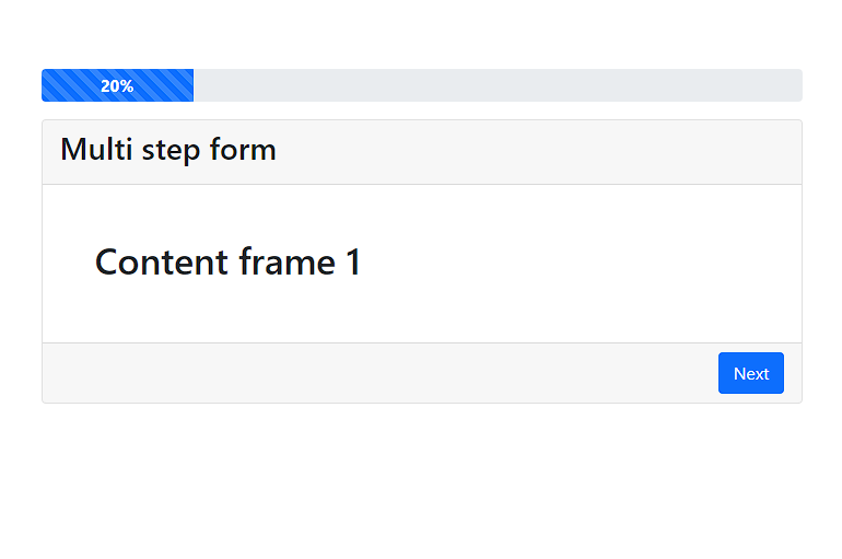
Multi step bootstrap responsive form Today we are going to make a responsive multi step form with bootstrap 5 and jquery. The multi step form consists o..
15-10-2022 0 reacties2022 © HostingBe.com CMS versie 2.2.2 